CLOVERSOFT
This is a brand refresh & packaging design project done by Elementary Co. for Cloversoft
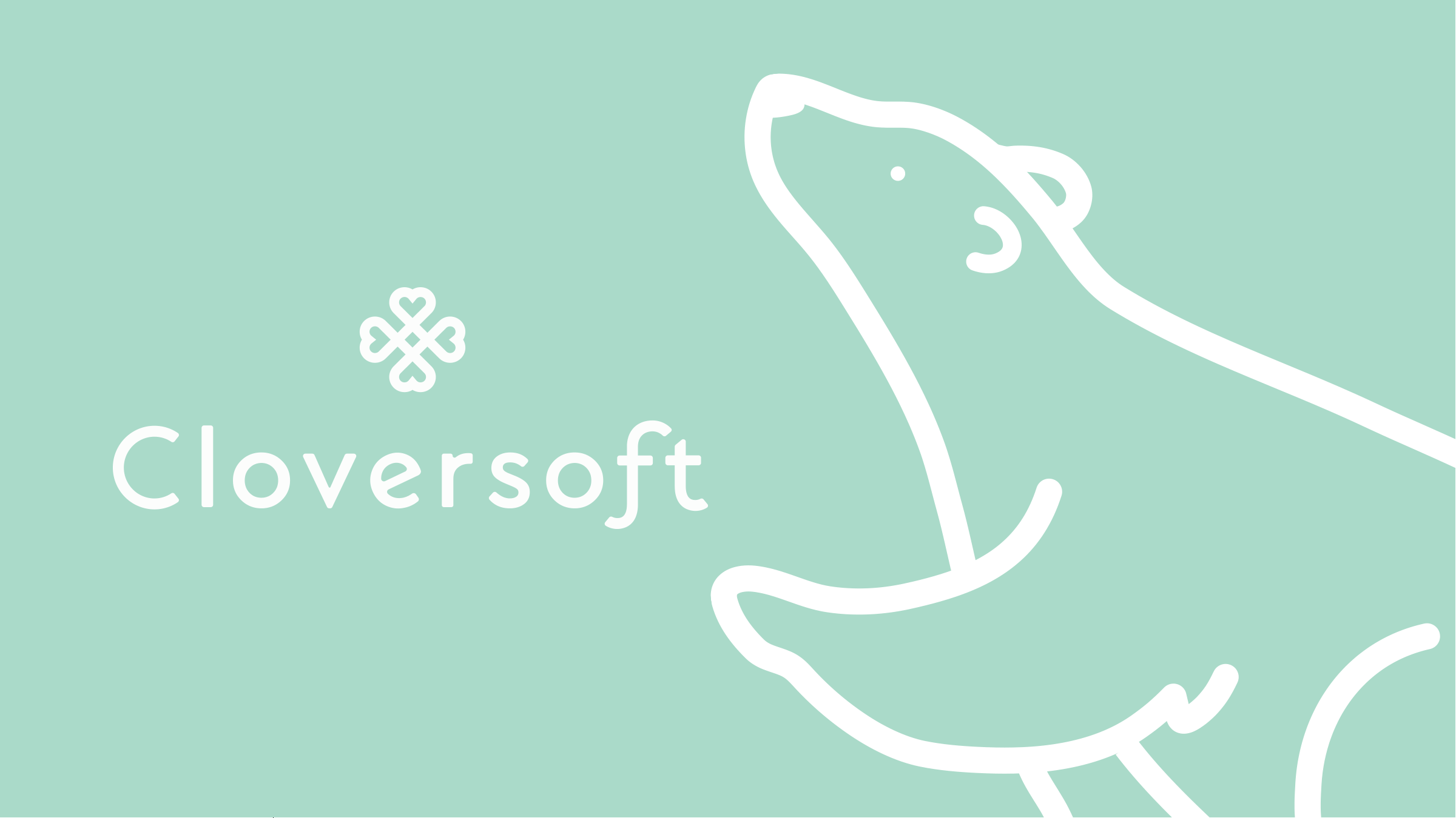
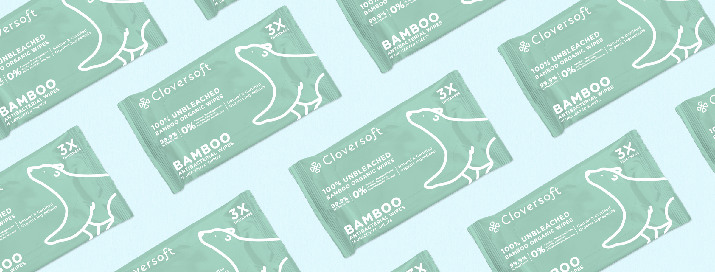
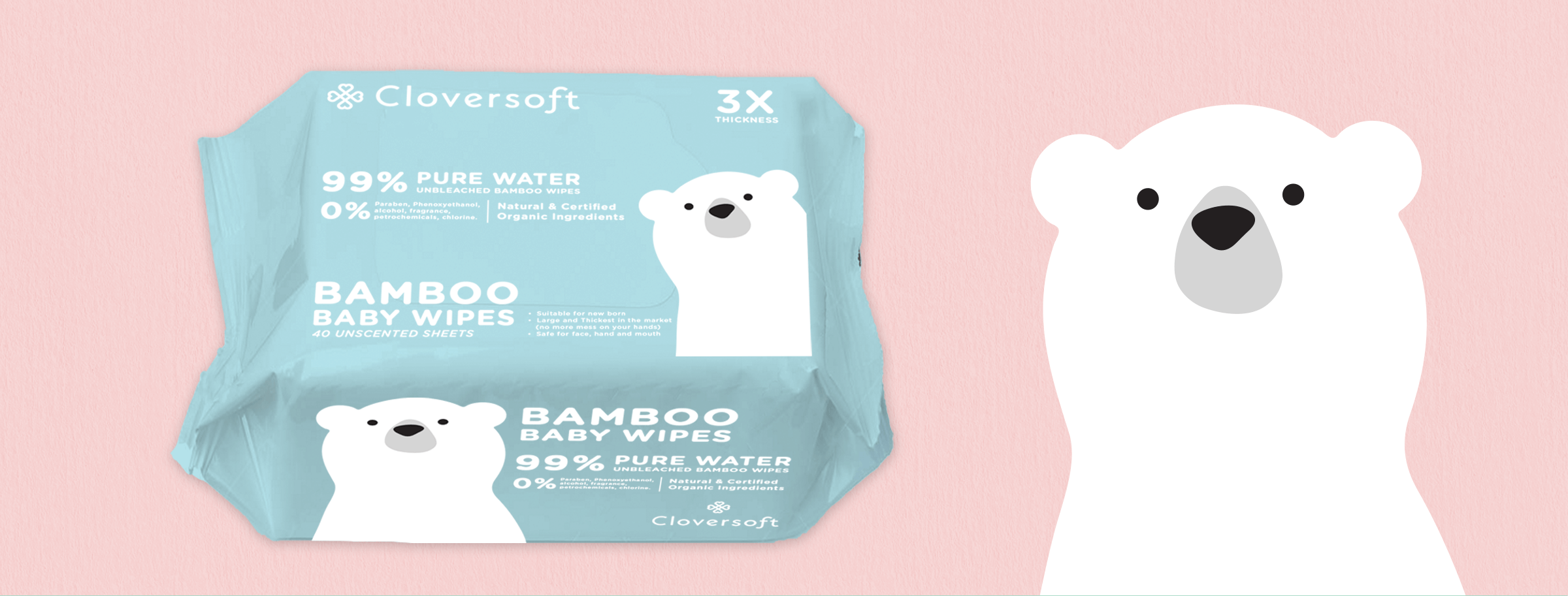
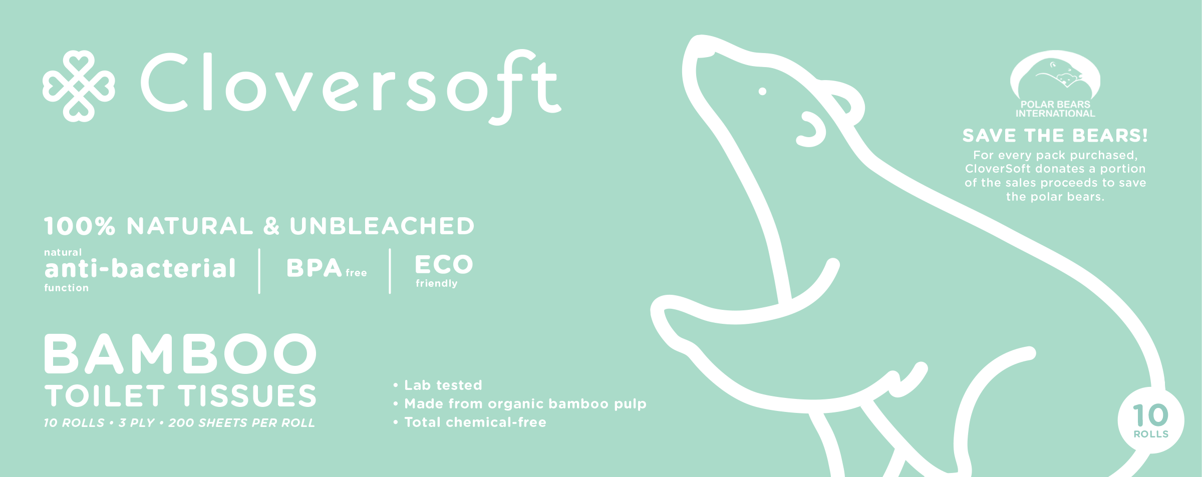
Cloversoft prides itself on being the Singapore’s only non-toxic and antibacterial tissues and wipes. Their environmentally friendly products are unbleached and made from bamboo. The brief was to rebrand and redesign the packaging so as to appeal to a younger target market.
Wanting to retain their signature brand icon of a polar bear on their packaging, we created custom illustrations for it that will appeal better to the target demographic. New brand colours were also introduced that were more on-brand.


CREDITS
Branding Elementary Co.
Year 2016
Client Cloversoft
Creative Director Russell Seah
Art Director Olivia Eleazar
Designer Olivia Eleazar & Benjamin Wang
Project Lead Russell Seah & Elaine Lau
FROM BEAN TO CUP
Coffee is a complex agricultural product that changes from year to year and requires the utmost care in growing, harvesting, processing, roasting, and brewing. The process of making coffee is so meticulous but yet the outcome of the beverage can be so spontaneous.
A cup of coffee is more than just a drink. Drinking coffee is a sensory experience in itself. Common Man Coffee Roasters prides itself to be an academy and roastery. Therefore, the “Bran to Cup” process plays an even more vital role in the brand story.